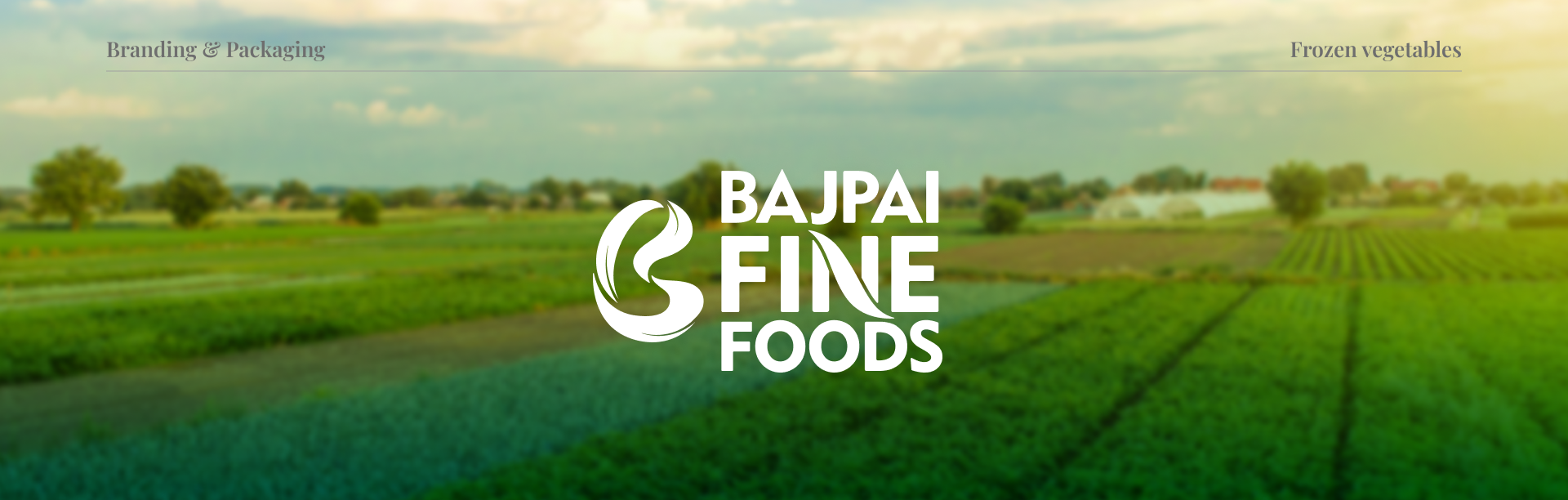
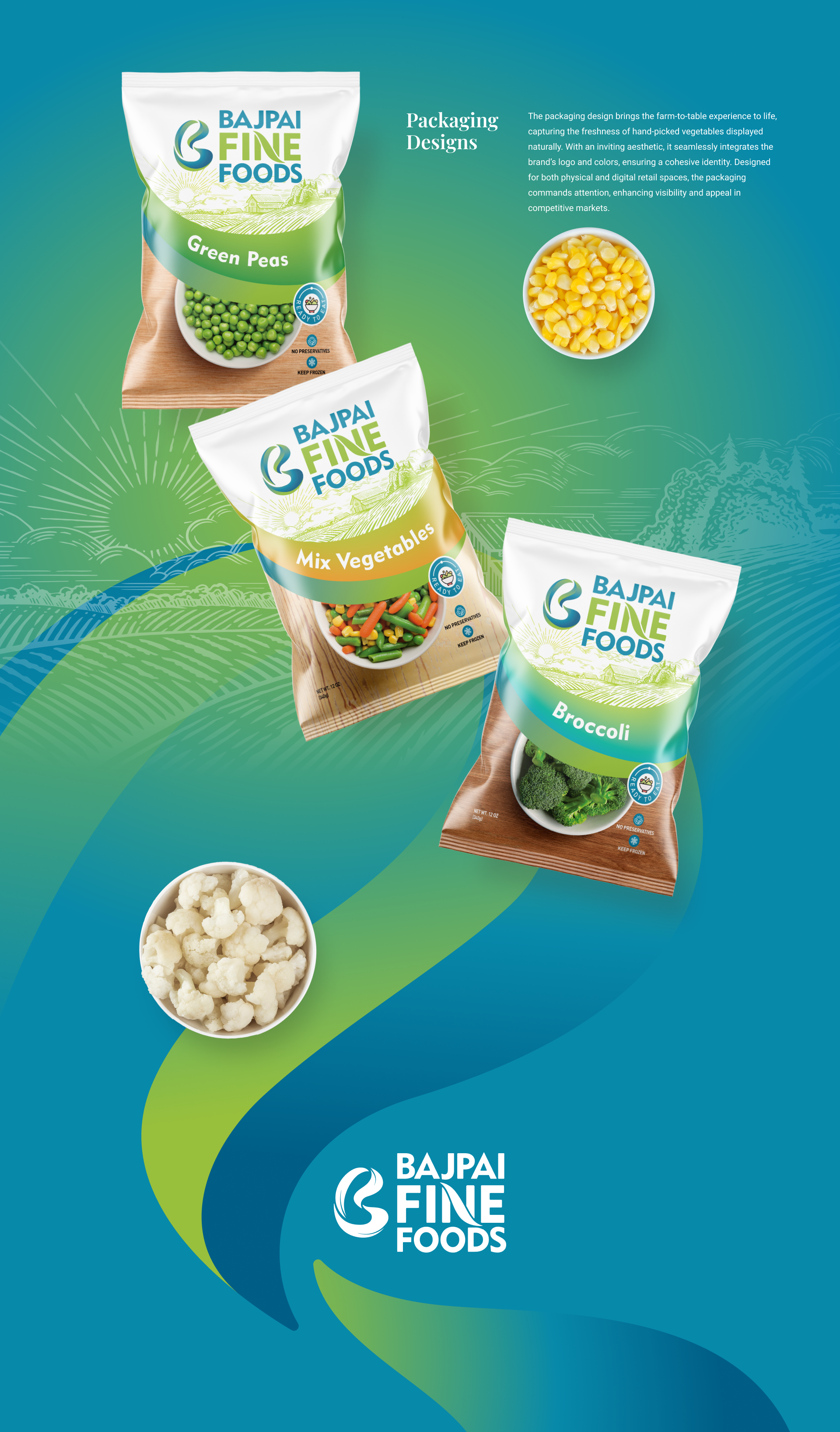
Bajpai Fine Foods is dedicated to providing high-quality frozen vegetables, carefully prepared without preservatives, artificial colors, or chemicals. The brand stands for purity, freshness, and a commitment to delivering nature’s goodness in its most wholesome form.
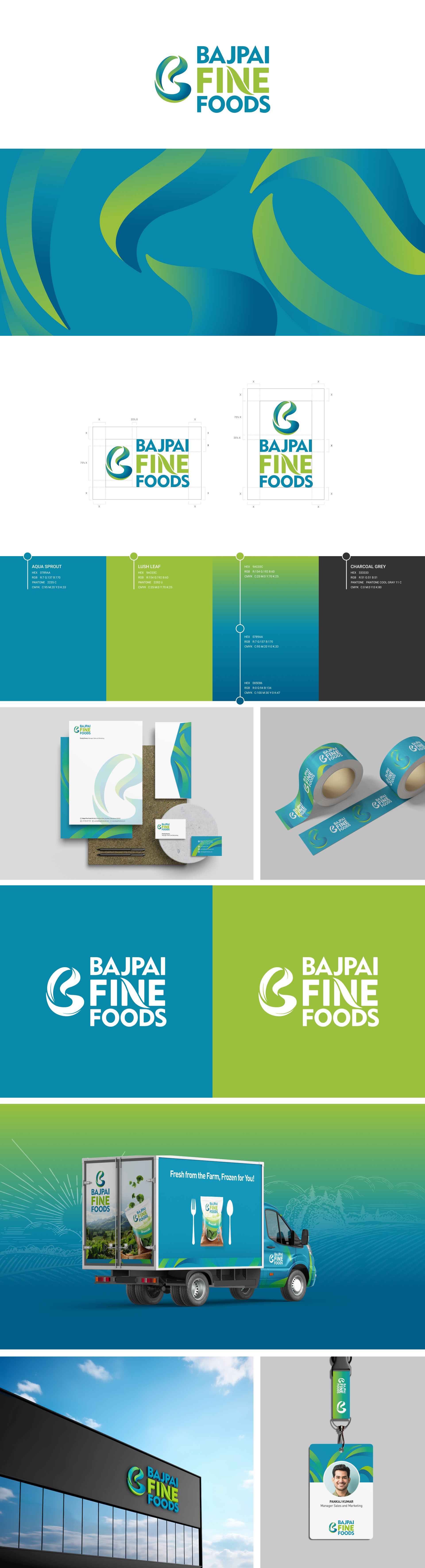
Logo Design and Branding
The logo embodies the brand’s essence through a symbolic representation of vegetables and leaves, designed in a unique graphic style. The color palette is thoughtfully chosen to align with the brand’s ethos, reinforcing its dedication to natural, preservative-free products.
The brand identity reflects Bajpai Fine Foods' core values of freshness, purity, and authenticity. Every visual element from typography to color choices has been crafted to communicate trust and transparency, ensuring a strong, memorable presence across all platforms.
Wayfinding Design
Our wayfinding system ensures seamless navigation across the campus with a clean, modern approach. Designed for clarity and impact, it features:
Highly Legible Typography – Optimized for visibility from a distance.
Intuitive Iconography – Enhancing quick recognition and guidance.
Primary Color Palette – Maintaining brand consistency while improving contrast and readability.
Intuitive Iconography – Enhancing quick recognition and guidance.
Primary Color Palette – Maintaining brand consistency while improving contrast and readability.
This system not only streamlines movement but also reinforces the brand’s commitment to efficiency and design excellence.

Social Media Campaign
Creative Strategy
This campaign highlights the journey of our frozen vegetables from farm to fork, emphasizing freshness, nutrition, and quality preservation. Using a three-part storytelling approach, we showcase:
This campaign highlights the journey of our frozen vegetables from farm to fork, emphasizing freshness, nutrition, and quality preservation. Using a three-part storytelling approach, we showcase:
Harvested Fresh – A farmer carefully selecting and harvesting vibrant vegetables at their peak.
Preserved Perfect – A worker at the factory ensuring nutrients and freshness are locked in.
Naturally Nutritious – A happy customer enjoying a fresh, healthy meal.
Preserved Perfect – A worker at the factory ensuring nutrients and freshness are locked in.
Naturally Nutritious – A happy customer enjoying a fresh, healthy meal.
Through visually engaging content and concise messaging, we reinforce trust in our brand, positioning frozen vegetables as just as fresh and nutritious as farm-picked produce.

Thanks!