Kanha Wellness is a holistic health sanctuary dedicated to empowering individuals on their healing journeys. Combining ancient wisdom with modern science, Kanha Wellness integrates Ayurveda, Naturopathy, Physiotherapy, Shingi Therapy, Quantum Healing, Homeopathy, and a diverse range of therapies to nurture the mind, body, and spirit.
Our mission is to provide personalized, natural, and effective healing solutions, helping people restore balance, vitality, and well-being. At Kanha Wellness, we believe in the transformative power of holistic health to unlock your true potential.
Our mission is to provide personalized, natural, and effective healing solutions, helping people restore balance, vitality, and well-being. At Kanha Wellness, we believe in the transformative power of holistic health to unlock your true potential.
Project
The Kanha Wellness brand identity is crafted to establish trust and connect with consumers on a profound level, offering a visual strategy that embodies holistic healing and well-being. The identity reflects the brand’s mission of guiding individuals to overcome health and emotional challenges, promoting complete physical, mental, and emotional wellness.
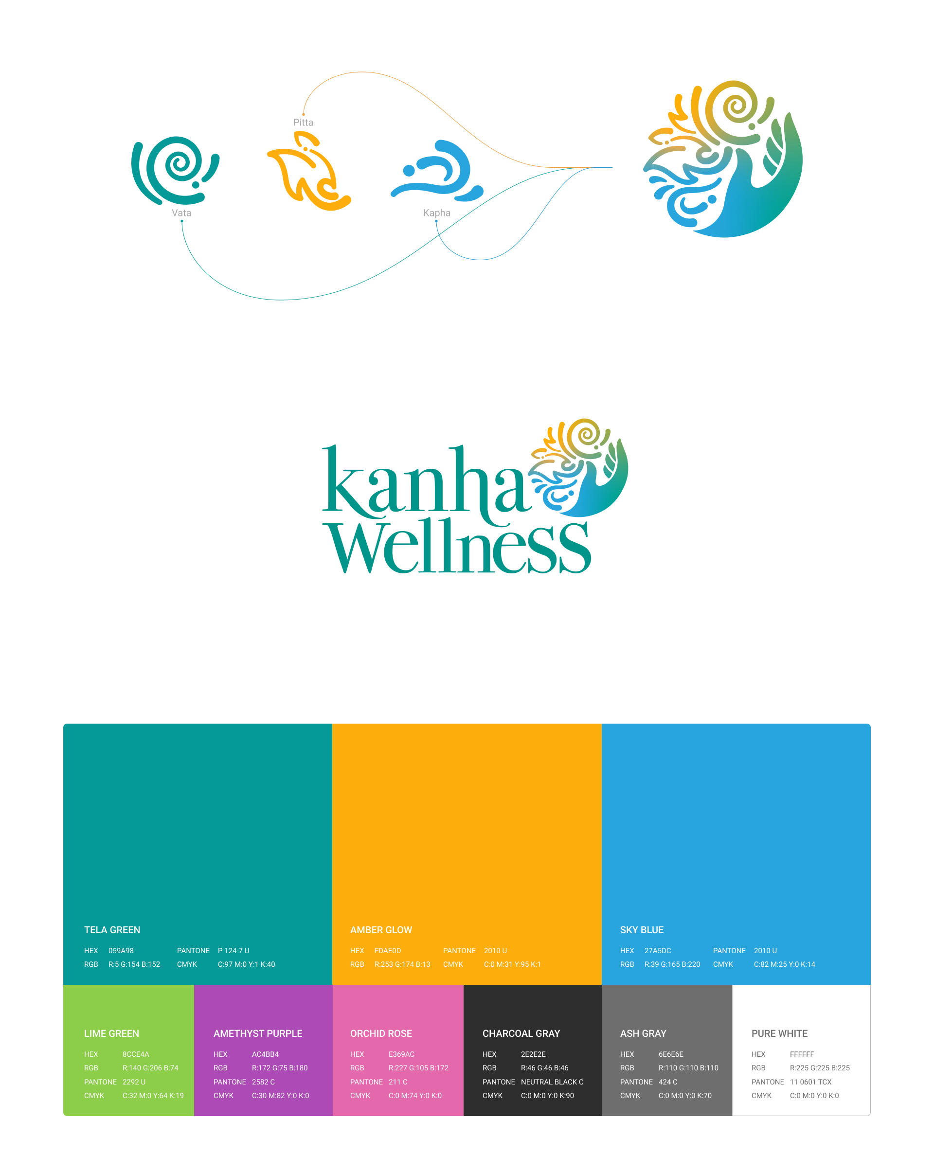
The logo design is rooted in the core principles of Ayurveda, focusing on the balance of Vata, Pitta, and Kapha—the three foundational elements of life. These elements are represented graphically within the logo symbol, harmonized by a healing hand that signifies balance and care.
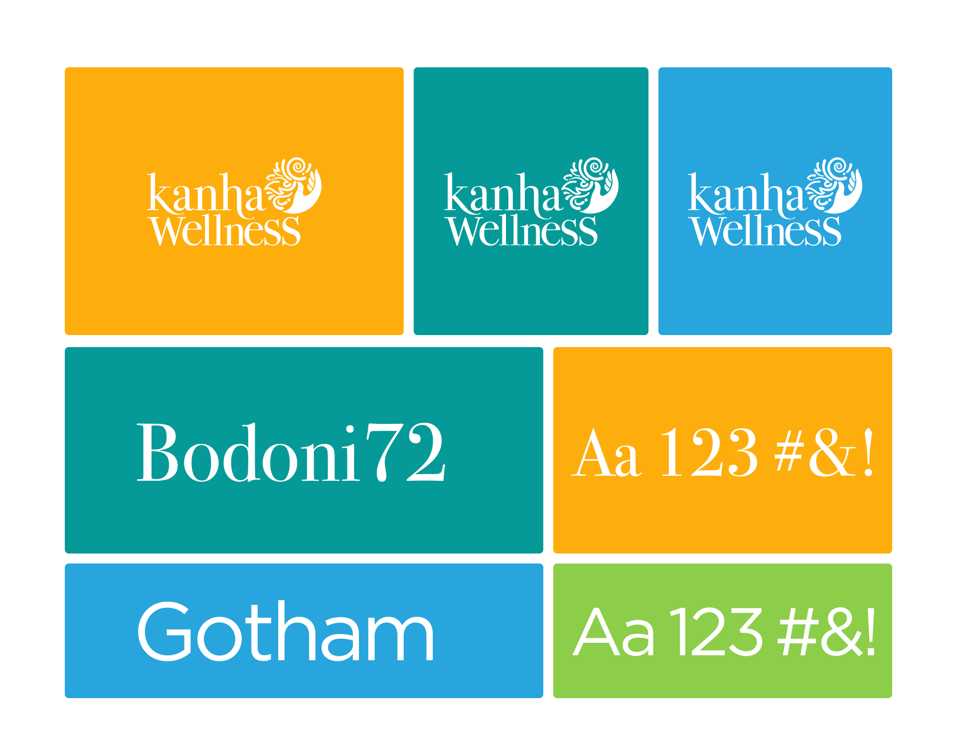
The logo typography features a customized Bodoni 72 serif font, lending an air of elegance, trust, and distinctiveness.
The logo typography features a customized Bodoni 72 serif font, lending an air of elegance, trust, and distinctiveness.
Primary Colors
Tela Green: Represents air and symbolizes Vata, signifying movement and vitality.
Ember Orange: Represents fire and symbolizes Pitta, embodying energy and transformation.
Blue: Represents water and symbolizes Kapha, reflecting stability and calmness.
Tela Green: Represents air and symbolizes Vata, signifying movement and vitality.
Ember Orange: Represents fire and symbolizes Pitta, embodying energy and transformation.
Blue: Represents water and symbolizes Kapha, reflecting stability and calmness.
Secondary Palette
A complementary set of colors supports and enhances the primary palette to create a cohesive and versatile visual system.
A complementary set of colors supports and enhances the primary palette to create a cohesive and versatile visual system.